Embroidery Trends That Look Professional in 2026
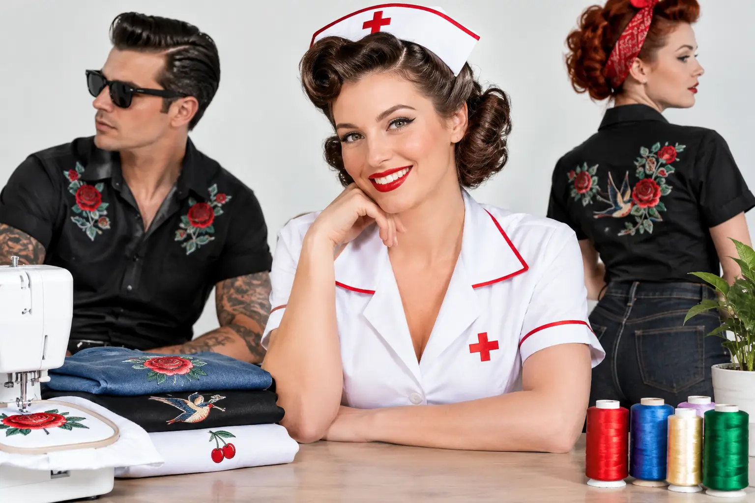
Embroidery trends for 2026 favor tonal texture, purposeful placement, and durable team apparel that looks polished long after the shift ends every day.
A logo on the left chest is still doing its job. The difference in current embroidery trends is that it is no longer expected to do all the work. Professionals want apparel that looks considered from every angle: a clean logo, a readable name, a garment with structure, and details that hold up through real shifts, real weather, and repeated washing.
For healthcare teams, dental offices, barns, schools, trades, and service businesses, the best trend is not the loudest one. It is a finished piece that makes the team look prepared before anyone says a word. For individual buyers, it is apparel that carries a little more personality than the standard issue quarter-zip - because sometimes the group chat deserves a jacket, too.
The Embroidery Trends Shaping Professional Apparel
The direction for 2026 is clear: less promotional clutter, more intentional identity. Embroidery is becoming more refined in color, placement, scale, and garment selection. That does not mean every order needs to be subtle. It means the garment, design, and job need to agree with each other.
A veterinary clinic may need friendly, approachable color. An EMS unit may need high-visibility function and clearly legible identifiers. A private practice may prefer a restrained, premium finish that looks right at the front desk and outside the office. The trend is customization with a purpose, not customization for its own sake.
Tonal embroidery is replacing default contrast
High-contrast thread has its place, especially where names, credentials, or safety information must be read quickly. But tonal embroidery - thread in a related shade to the garment - is increasingly the choice for polished outerwear, vests, and elevated polos.
Think charcoal thread on a black jacket, deep navy on a navy vest, or warm cream on a sand-colored quarter-zip. The result has texture and dimension without feeling like a billboard. It works particularly well for office teams, specialty practices, equestrian programs, and client-facing staff who want a uniform that reads as premium rather than promotional.
The trade-off is visibility. A logo with fine detail or small lettering may disappear when thread and fabric are too close in value. Tonal work should be designed for the garment, not chosen simply because it photographs well. A professional embroidery shop will help you balance restraint with readability.
Small, clean left-chest marks remain the standard
The left chest logo is not going anywhere, and it should not. It remains the most recognizable placement for uniforms, polos, jackets, and vests because it is easy to see in conversation and works across a range of garment sizes.
What is changing is scale. Oversized chest embroidery can feel dated, can distort lighter fabrics, and often makes detailed logos harder to read. A well-digitized, appropriately sized mark looks sharper and wears better. For names and credentials, a clean line beneath or beside the logo is usually stronger than squeezing every title, certification, and department designation into one dense block.
There are exceptions. Athletic departments, barn teams, and event apparel may benefit from a bolder front treatment. The rule is simple: choose the scale that fits the role of the garment. A work jacket is not a trade-show giveaway.
Sleeve embroidery adds identity without crowding the front
Sleeve placement is one of the most useful embroidery trends for teams that need more information than the left chest can carry. It gives a department, location, unit designation, flag, year, or secondary mark a dedicated place without overwhelming the primary logo.
For medical teams, a sleeve can carry a specialty or department name while the chest stays clean. For trades and service crews, it can separate a company logo from a personal name or role. For equestrian teams, it can add a barn name, horse-show designation, or understated monogram.
Sleeve embroidery does require planning. Not every jacket construction provides an equally smooth stitching area, and some placements can be harder to see when the wearer is moving. It is best used as a supporting detail, not as the sole source of identification.
Names and credentials are getting more disciplined
Personalization still matters. In fact, for healthcare and professional teams, it is often the detail that turns a uniform into a piece someone is proud to wear. The trend is toward better hierarchy: name first, credentials where relevant, and enough breathing room for both to stay legible.
Choose a thread color with clear contrast and a font that can survive the realities of embroidery. Tiny script may look elegant on a screen but can lose clarity in thread, especially on textured fleece or heavily structured fabric. A classic block or refined serif style often has more staying power.
Credentials should be included when they help patients, clients, students, or coworkers understand the wearer’s role. They are less useful when they turn a chest panel into an abbreviation contest. A thoughtful layout signals professionalism better than a longer line of text.
Texture Is Part of the Design
Embroidery is not ink. It has height, stitch direction, sheen, and feel. That tactile quality is exactly why it remains a stronger option for uniforms and outerwear than a quick printed logo.
Modern embroidery favors designs that respect the medium. Simple shapes, strong letterforms, controlled stitch density, and intentional negative space tend to produce the best results. A complex illustration may be central to a brand identity, but it may need a simplified embroidery version to remain clear at jacket scale.
This is where digitizing matters. A logo file is not automatically an embroidery-ready file. The design must be translated into stitch paths, underlay, density, and sequence for the specific fabric. The same logo may need different treatment on a lightweight polo, a stretch performance layer, and a heavyweight jacket. Skipping that consideration is how good artwork becomes a stiff patch of thread.
Dimension works best when it is earned
Raised embroidery and thicker, more dimensional stitching can add presence to hats, structured bags, and select outerwear. It is a strong choice for short names, initials, bold icons, or simple type. Used well, it makes a design feel substantial.
Used on a detailed clinic logo or a line of credentials, it can make the piece harder to read. The point is not to add height everywhere. It is to use texture where texture supports the design.
Garment Choice Is Driving Embroidery Decisions
One of the most practical embroidery trends is the move away from choosing a garment last. The fabric and construction should guide the decoration plan from the start.
Structured jackets and vests remain reliable choices for teams that need a polished look in cooler settings. They give embroidery a stable surface and offer enough weight to make a logo feel integrated rather than added on. Performance polos are useful for active workplaces, but their stretch and lighter weight call for thoughtful stitch density. Heavy embroidery can pull or pucker technical fabric if it is not prepared properly.
For organizations ordering across a size range, garment consistency matters just as much as color. If staff members have access to several compatible styles - for example, a vest, a full-zip jacket, and a polo in the same brand palette - the team can dress for the workday without losing visual unity.
That flexibility is especially valuable in healthcare, hospitality, schools, and field services, where one uniform silhouette rarely suits every role or every season.
Personality Is Moving to the Right Places
Not every embroidered piece needs to be serious. Boutique apparel, gifts, weekend bags, and off-shift layers are where humor and personal pride can take the lead. A nurse can wear a crisp embroidered work jacket on Monday and a medical-humor tee that earns a knowing nod in the break room on Friday. Both belong in a professional wardrobe when the setting is right.
The strongest personal designs are specific enough to feel seen without trying too hard. That is the difference between generic occupation merch and something a coworker immediately wants to text to the unit. Corazón De Oro approaches that balance with the same standard applied to custom work: good material, clean execution, and respect for the people wearing it.
How to Choose a Trend That Will Still Look Right Later
Before approving an embroidered order, ask what the piece needs to accomplish. Does it need to identify staff quickly? Build patient or client trust? Survive outdoor work? Mark a team achievement? Be a gift people actually use? The answer should guide the placement, garment, thread color, and amount of personalization.
A useful order is not necessarily the one with the most decoration. Often, a premium jacket with a clear chest logo, a properly spaced name, and a complementary sleeve detail will outlast a louder design in both wear and visual appeal. Request a layout that reflects the actual garment and consider how the embroidery will read from a few feet away, not only on a computer screen.
The best embroidery does not chase attention. It earns confidence through clean detail, durable materials, and a design that makes the wearer feel ready for the work in front of them.