EMS Jacket Example Ideas for a Cohesive Crew
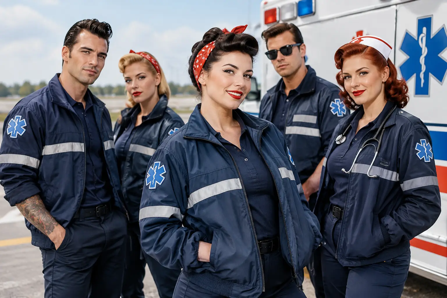
Need an EMS jacket example for your crew? See how placement, credentials, colors, and garment choices create a clear, durable look for daily field calls.
A good EMS jacket example does more than put a logo on an outer layer. It answers practical questions in a glance: Who is on the crew? What is their role? Which agency or department are they representing? When a call runs late, the weather turns, and everyone is moving with purpose, those details need to be clear without looking cluttered.
The strongest jackets balance field function with a clean, consistent identity. That does not mean every mark needs to be oversized or every available panel needs decoration. In fact, restraint usually produces the better result. A well-chosen jacket, a readable department name, and thoughtful placement can carry the whole piece.
What a Strong EMS Jacket Example Includes
Start with the job the jacket needs to do. A jacket for station wear, public events, and transport work may call for a different weight and finish than one intended for long roadside scenes or cold overnight coverage. The garment is the foundation. Once it is selected, the design should support it rather than compete with it.
A classic EMS jacket layout typically uses the left chest for an agency name, service mark, or individual name and credentials. The back carries the clearest identification, often a department or service name large enough to read from a reasonable distance. A sleeve can hold a patch, flag, or unit-level identifier when that detail genuinely serves the organization.
The point is hierarchy. Someone looking at the jacket should understand the organization first, then the wearer’s role if needed. Trying to give the chest, back, both sleeves, and collar equal visual weight creates a piece that feels busy before it feels capable.
Example 1: The Department-First Jacket
For a municipal or third-service crew, the department-first approach is often the cleanest. Picture a dark, durable jacket with the service name or approved emblem on the left chest. Across the back, the department name is presented in high-contrast thread with a simple, legible type treatment. The wearer’s last name can sit beneath the chest mark or on the opposite chest, depending on the department’s standards.
This arrangement works because it makes the agency unmistakable without turning the garment into a bulletin board. It is especially useful when jackets are shared across a large team and need to remain consistent through new hires, promotions, and changing assignments.
Example 2: The Role-Clear Crew Jacket
Some teams need role identification to be more visible. A supervisor, field training officer, community paramedic, or special-event team may benefit from a controlled role line under the wearer’s name or on the back beneath the service name.
The key word is controlled. Use one role designation, in one established location, at a smaller scale than the organization name. “PARAMEDIC” or “EMT” can be useful when it helps with public-facing work or multi-agency scenes. It can become noise when every credential, certification, and title is given equal billing.
If the organization already uses a shoulder patch that identifies rank or level, repeating that same information in three other places may not add value. An EMS jacket should communicate quickly, not ask people to read it like a résumé.
Example 3: The Event and Outreach Jacket
Not every EMS jacket is built for the same setting. A crew working standby coverage at a community event, school function, or public-safety demonstration may want a more approachable version of its standard look. The agency mark remains central, but the overall design can be less tactical and more polished.
In this case, a premium jacket with a simple chest logo and a clear back identifier usually does the work. Add names only if the organization wants that personal touch. For teams that regularly interact with families, community partners, or event organizers, this can feel more considered than a jacket overloaded with operational details.
There is room for personality here, but it should come from the team’s real identity, not a trend. A small, approved unit mark or a meaningful local detail can be memorable. The jacket still needs to represent the service long after a particular event is over.
Choose Colors for Readability, Not Just Preference
Black, navy, charcoal, and deep red are common starting points for a reason: they wear well, coordinate with field gear, and give thread colors enough contrast to be seen. But the best choice depends on the agency’s existing marks, the environment, and who will be wearing the jacket.
Thread color should be selected against the actual garment color, not a computer screen alone. A logo that looks sharp on a white mockup can lose definition on black fleece or heathered fabric. Fine lines, small lettering, and color transitions may need adjustment so the finished result stays readable at normal viewing distance.
For most teams, two thread colors are enough. A primary color establishes the design; a secondary color provides contrast or preserves a logo detail. Adding more colors can be appropriate for a recognized agency emblem, but extra color should have a reason. Premium does not mean complicated.
Placement Is a Field Decision
The left chest remains a standard placement because it is familiar, balanced, and visible during conversation. It is a good home for an agency mark, department name, or a name-and-credential line. The back is where larger identification belongs, particularly for jackets worn around the public or alongside other responding agencies.
Sleeves are useful, but they are not mandatory. A shoulder patch can look sharp and carry history, especially when an organization has an established insignia. It may be unnecessary when a clean chest-and-back layout already says everything needed. Also consider how sleeves move, where radio straps sit, and whether the garment has pockets, panels, or reflective trim that affect available space.
Before approving a design, ask a practical question: will the placement still work when the wearer has a radio, outer vest, backpack straps, or a patient-care task in front of them? A jacket is not a framed display piece. It has to perform while its wearer does.
Names and Credentials: Useful, With Limits
Adding a name makes a jacket feel assigned rather than issued. For many crews, that sense of ownership matters. It can also simplify identification at community events, trainings, and public interactions.
Credentials deserve more judgment. “EMT,” “AEMT,” and “PARAMEDIC” can be appropriate where the agency wants the public or partner organizations to recognize clinical roles. A longer stack of certifications may be meaningful to the wearer but difficult to read and hard to standardize across a crew.
A good rule is to include what supports the team’s purpose. If a credential is required by agency policy or improves role recognition, it belongs in the conversation. If it only makes the jacket more crowded, it may be better left off.
Build Consistency Before You Build a Big Order
The fastest route to mismatched team apparel is letting every person make separate design decisions. One person requests a chest name, another wants three lines of credentials, and a third uses an old logo file from a phone. The results may all be technically correct, yet they will not look like one organization.
Set a simple standard first: garment color, approved logo version, chest layout, back layout, thread colors, name format, and any optional sleeve detail. This does not need to be a complicated policy. It just needs to be clear enough that the tenth jacket matches the first.
For organizations ordering custom pieces, review the artwork and garment proof with the people who will actually wear the jackets. Operations leadership may focus on agency standards; crew members may catch an issue with pocket access, sleeve placement, or readability. Both perspectives matter.
Corazón De Oro Apparel approaches custom embroidery as a finished professional piece, not an afterthought added to a generic jacket. That means considering the garment and the marking together, so the crew receives something built for repeat wear rather than a one-time photo.
The Best Example Is the One Your Team Will Wear
A useful EMS jacket example is not necessarily the one with the most decoration, the loudest color, or the longest credential line. It is the one that fits the crew’s environment, reflects the service accurately, and remains easy to identify after a full season of calls, washes, weather, and long shifts.
Keep the design clear. Give every placement a job. Then let the jacket do what good team gear should do: show up ready, look consistent, and let the people wearing it get back to the work that matters.