How to Choose Embroidery Fonts That Stitch Cleanly
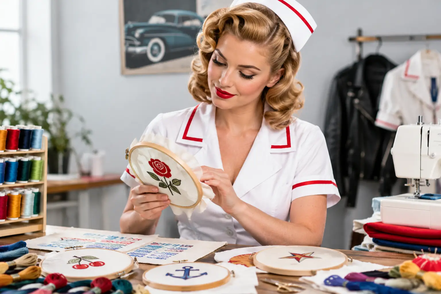
Learn how to choose embroidery fonts for names, credentials, and logos, balancing readability, garment scale, thread detail, and lasting wear confidently.
A font can make a name look established, approachable, sharp, or strangely hard to read from three feet away. That is why learning how to choose embroidery fonts is less about finding the prettiest option on a screen and more about choosing lettering that holds its shape in thread. The right font respects the garment, the message, and the person wearing it.
For a single name on a jacket, a credential line, or a small logo detail, restraint usually produces the strongest result. Thread has dimension. Fabric has texture. Both change how letters behave compared with ink on a monitor.
Start With the Job the Font Needs to Do
Before comparing type styles, decide what someone needs to read and when. A name is personal and should feel clear at a conversational distance. A title or credential line needs to remain legible even when it is smaller. A logo may carry its own established personality, but it still has to translate into clean stitched shapes.
This distinction matters because one font does not solve every job. A bold sans serif can make a short name feel confident and direct. A classic serif can bring more formality, especially when the lettering is large enough to preserve its fine details. A script may be a beautiful choice for a personal accent, but it asks more of the stitching process and the reader.
Think about the setting, too. If the lettering will be seen during quick introductions, movement, or everyday use, readability should lead. If it is a commemorative piece or a gift where the design is viewed up close, you may have a little more room for personality.
How to Choose Embroidery Fonts for Readability
The first rule is simple: choose letters that remain distinct after they become thread. Open counters - the enclosed or partially enclosed spaces in letters such as A, B, D, O, P, and R - help a font stay readable. So do clean strokes, moderate spacing, and recognizable letterforms.
Avoid treating tiny embroidery like tiny print. Thin strokes can disappear, tight curves can fill in, and narrow gaps can close once the thread settles into the fabric. A font that looks delicate and polished in a digital mockup may become muddy when reduced for a pocket-area name or a compact second line.
Block fonts, clean sans serifs, and well-proportioned serif fonts are dependable choices because their shapes are easy to recognize. That does not mean every piece needs to look corporate. A rounded font can feel warm. A slightly condensed font can look refined. The key is choosing character without sacrificing instant recognition.
Scripts deserve a more careful conversation. They can add elegance and individuality, particularly for a larger first name or a one-word phrase. But highly decorative scripts often create letter collisions, overly thin connections, and ambiguous characters. If someone has to pause to decide whether a letter is an L, S, or E, the font is doing too much.
Size Is Part of the Font Decision
Font choice and text size are inseparable. The same typeface can stitch beautifully at a larger size and poorly at a smaller one. This is especially true for thin serifs, narrow uppercase letters, and script details.
A short name gives you flexibility because it can be sized generously without dominating the garment. A longer name may call for a simpler typeface rather than an aggressively condensed one. Condensing can technically make the text fit, but it can also squeeze interior spaces and make the finished letters feel cramped.
Two-line layouts need their own hierarchy. In most cases, the name should have more visual weight than the line beneath it. If a credential, role, or department is included, a clean secondary font or a smaller version of the main font often works best. The goal is not to make every line compete. It is to make the information easy to scan in the right order.
Uppercase lettering can look crisp and authoritative, but it may be less readable for some long names because every letter has a similar height. Upper and lowercase lettering usually creates a more natural reading rhythm. All caps can still be a strong choice for abbreviations, short departments, or concise statements where clarity and structure matter most.
Consider the Fabric Before You Fall for a Font
Embroidery does not sit on a blank page. Smooth, stable fabric gives fine details a better chance of showing clearly. Textured, stretchy, lofty, or heavily brushed materials can absorb small lettering and soften sharp edges.
That does not mean certain garments are off limits. It means the font must work with the material instead of fighting it. On a fabric with more texture, choose bolder strokes, simpler shapes, and slightly more generous spacing. On smoother material, you may be able to use a more detailed style, provided the lettering is not too small.
The thread color matters here as well. High contrast generally improves readability, but contrast alone cannot rescue an overly ornate font. A dark thread on a light garment or a light thread on a dark garment gives the letters a clean visual edge. Tonal thread can be understated and premium, though it works best when the font is uncomplicated and the placement is large enough to read.
Match the Font to the Message, Not the Mood Board
A font should support the purpose of the piece, not distract from it. For names, clean and confident often wins. For credentials or designation lines, prioritize precision. For a small brand mark, protect the recognizable elements of the original identity while accepting that a simplified embroidery version may be necessary.
This is where many otherwise good designs go sideways. A popular font on social media may have the right mood but the wrong construction for thread. Likewise, a complex logo may need its smallest details adjusted before it can be reproduced cleanly. Simplification is not a compromise when it makes the final result more legible and durable. It is good production judgment.
If you are coordinating a group order, limit the number of font styles. One primary font and, if needed, one supporting font creates consistency without making every piece feel generic. Use the same capitalization, placement, and thread color rules whenever possible. Those details keep an order cohesive, even when each person has a different name length.
Review a Mockup With Real-World Questions
A digital proof is valuable, but look at it critically. Do not only ask whether it looks attractive at full-screen size. Ask whether the lettering will still be clear at the actual finished scale.
Check spelling, credentials, punctuation, and capitalization first. Then look at the spaces inside and between letters. Are the narrow areas likely to fill? Are letters touching where they should not? Does the second line look crowded? A good mockup should answer these questions before thread ever meets fabric.
It also helps to picture the item in use. Will a person read it while standing nearby? Is the color combination visible under indoor lighting? Does the font feel balanced with the garment's seams, pockets, or other design elements? Small adjustments at proof stage are much easier than wishing a script had been one step simpler after the piece is finished.
For a logo, submit the cleanest artwork available and be open to practical recommendations. Artwork made for screens, signs, or print may not be ready for embroidery without refinement. A skilled embroidery partner will focus on preserving what makes the logo yours while ensuring that the final stitching stays clean.
A Simple Decision Rule When You Are Torn
When two fonts both look good, choose the one that is easier to read, has fewer fragile details, and fits the available space without being squeezed. That choice tends to age better through repeated wear and laundering.
Save the highly decorative option for designs where it has enough room to breathe. Use the disciplined option for names, credentials, and compact information. There is plenty of personality in a well-chosen thread color, balanced placement, and lettering that looks intentional rather than overworked.
The best embroidered font rarely calls attention to itself first. It lets the name, message, or mark do the talking - cleanly, confidently, and with the kind of finish people notice for all the right reasons.